Creating A Unified UX Style Guide and UI Design System for a Mobile Drama Game

Overview
For a publisher-funded project, Scriptic needed new screens built that also utilised legacy UI in their game engine.
These legacy screens caused user navigation issues and were inconsistent, negatively impacting product quality.
I solved this by redesigning legacy screens and creating the new ones simultaneously, establishing a UX Style Guide and UI Design System to standardise the experience.
This redesign improved user navigation, product quality, and reduced developer lead time.
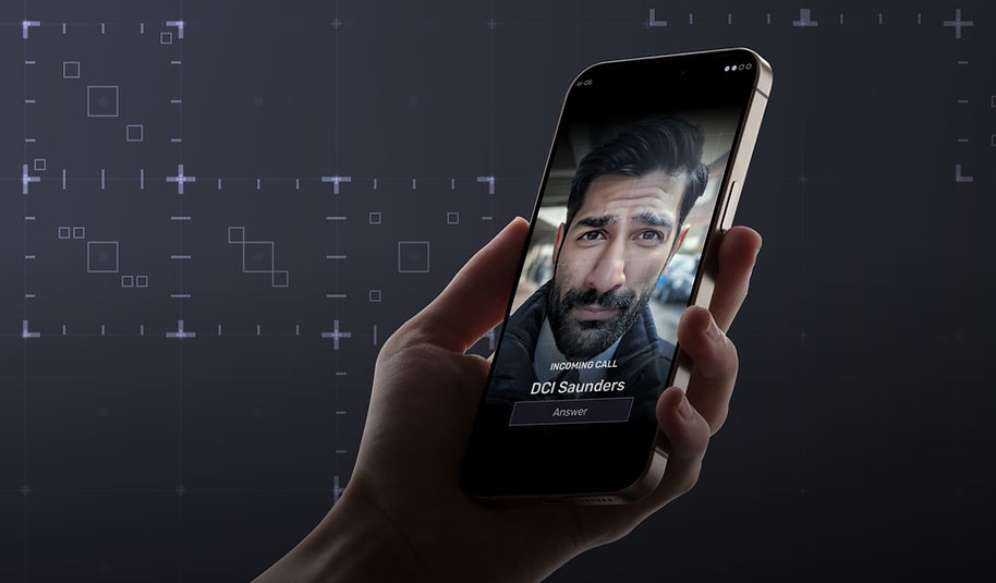
The game involved real-world style apps (banking app, chat apps, for example), and a sophisticated Police interface where players would take on the role of a detective looking for clues and communicating with their team.
-
My Role: UX/UI Designer & Art Director
-
Project: Unamed Announced Crime Investigation Title
-
Audience: Crime enthusiasts, mobile gamers
-
Timeline: 10 weeks of UX pre-production, 2 months of UI production

Discovery & Research
Problem: Balance New Screens With Legacy Screens
While the business goal was to create a new game for a major publisher using a well-known IP, the project began with a clear problem: the existing game engine's legacy UI screens were a source of friction and inconsistency.
Designed By Accretion
These screens, developed through accretion over time, suffered from a lack of a cohesive design system. Specific issues included inconsistent layouts, poor visual design (no established padding or spacing rules, multiple fonts), and unclear navigation.
I first identified these problems by conducting a heuristic evaluation of the old screens to isolate specific usability issues.

Here are two sets of legacy screens (both news apps) showing measurements for similar components within. Even in their header sections, the back arrow placement is in slightly different positions, adding to the overal inconsistent look and feel.
Constraint: A Change Here Is A Change Elsewhere
A significant technical constraint was that any changes to a legacy screen in the new project would also affect the live versions of Scriptic's flagship games, as they were using a shared game engine. This meant my redesign needed to be a strategic evolution rather than a complete overhaul, requiring careful consideration and content sign-off for any major functionality changes.
Strategy & Ideation
Creating Consistency On Every Screen
With a clear understanding of the problems, I sought to standardise the game’s user experience. My strategy was built on a series of focused "sweeps" through all existing and new game screens:
-
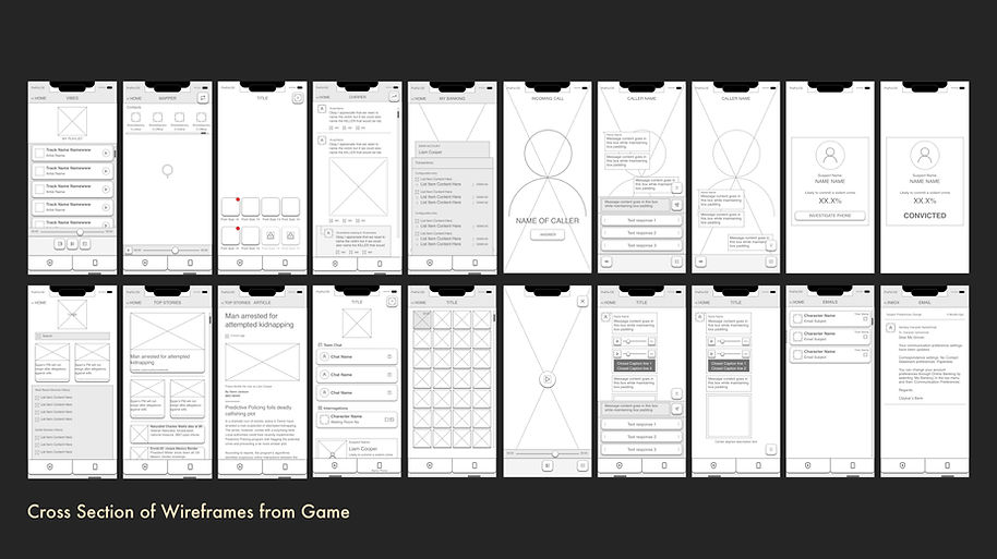
Component Unification: I began by wireframing every screen, identifying and reusing similar components to create a unified system.
-
Navigation Overhaul: I introduced a persistent bottom bar navigation and refined the header to ensure players always knew their location within the complex game screens and how to get where they needed to go.
-
Grid and Spacing: A third sweep addressed spacing, padding, and breakpoints, creating a consistent visual rhythm and better hierarchy.
-
Final Layout: The final sweep refined layouts to align with the Unity Reference Image used by the game engine, ensuring seamless implementation.

An example of component consolidation can be seen here. I designed a single, reusable Avatar Component and created variants to serve different contexts. This modular approach ensured a consistent visual layout.
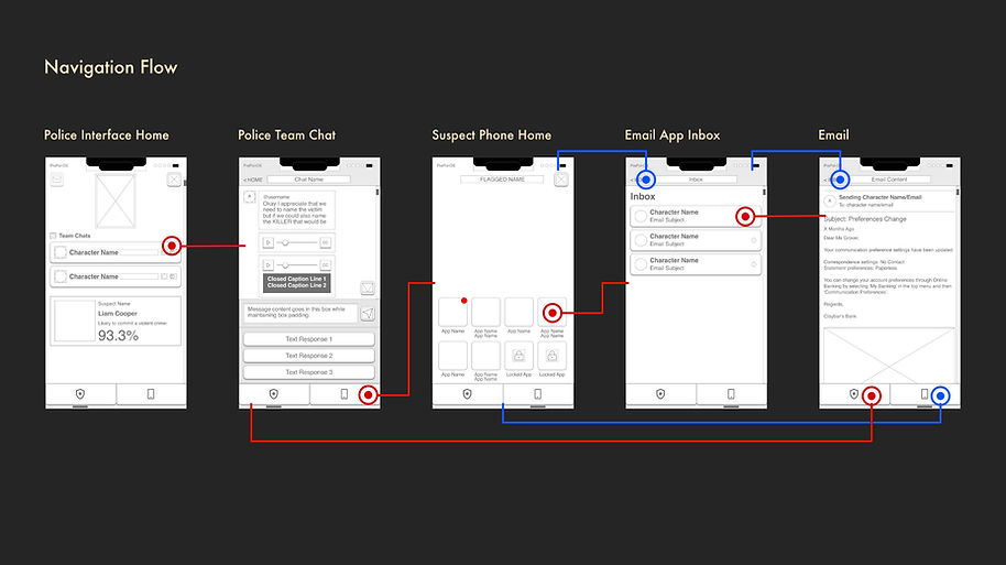
This user flow demonstrates a key player journey and validates the design of the new bottom navigation bar. The flow maps the player's path through the police chat, into a suspect's phone, and back to interact with NPCs.
Documenting These Changes
As this work on the wireframes concluded with the final sweep, I created a detailed UX Style Guide in Confluence and used Adobe XD to create clickable prototypes and user flows to detail any complicated interactions in the game. These prototypes were crucial for validating design choices and helping stakeholders visualise the significant changes being proposed, as well as helping to prepare developers for what they were going to have to build.

My handoff process was designed to ensure a seamless transition from design to development. These annotated wireframes were a key tool where I would provide a "clean" mockup of the screen, followed by a detailed layout that colour-coded the padding and spacing rules for every element. A final mockup, showing only the text bounding boxes, gave developers a precise reference for the screen's structure.
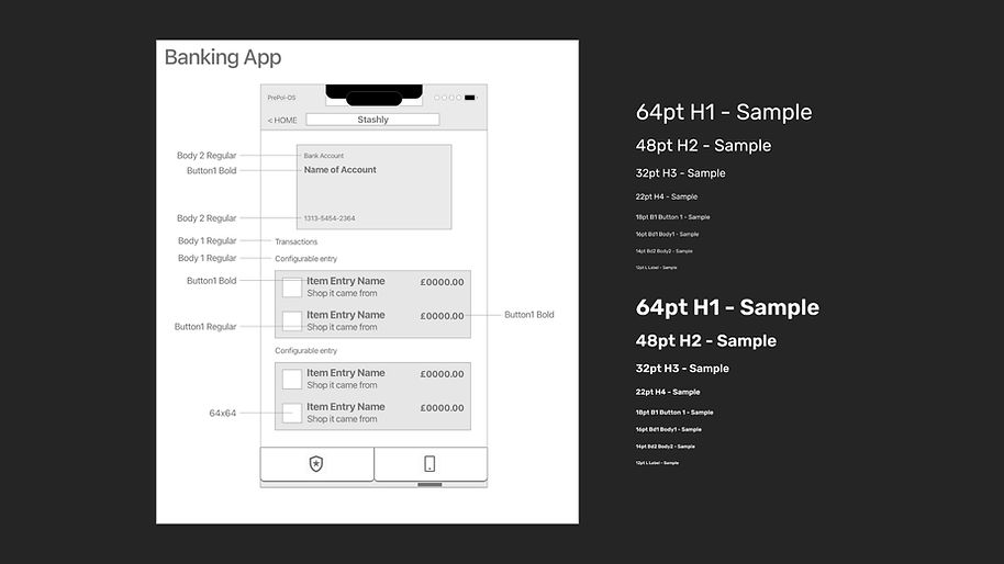
Added to the above mockups, I also handed over documents that denoted fixed sizes of elements as well as the font sizes being used.
Changes Based On Design Principles
During the rework of legacy screens and conception of new ones, the design principles I focused on were hierarchy, clarity, and familiarity, modeling screens after real-world apps to make them feel instantly intuitive for players while ensuring the UI supported the needs of the narrative by surfacing the relevant information to the player at the right time.

Execution & Implementation
Finding The Look of the Police UI
After the wireframes were finalised, I conducted a UI style exploration through moodboards and concept art, searching for the dark, future-modern aesthetic with a subtle use textures the game director sought. I then created mockups by applying the visual language directly over the wireframes in Adobe Illustrator to communicate the art direction the product could take.

The first step in defining the game's aesthetic was to visually explore the "future modern" style. I created a moodboard to define the project’s tone, ranging from functional real-world interfaces to highly stylised sci-fi examples. This exploration helped me land on the UI from the movie 'Superman v Batman,' as the ideal reference to direct the concept designs.

Early explorations on tone and texture that were guided by the moodboard exploration.

With the overall tone selected, I applied it to the wireframes to establish the final look of the Police Interface. This design served a strategic purpose by creating a deliberate visual contrast with the rest of the game's UI.
The police screens were designed to be sharp and dark, while the consumer-styled apps on suspects' phones used rounded corners and more expressive colours to feel familiar and personal to the user.
Final Visuals UI Gallery (Police and Apps)


Handing Everything Over To The Developers
My handoff process was designed to be as efficient as possible. I added to my comprehensive Confluence project (where the wireframes had already been published and made accessible), with clear documents for the UIs of the game. These detailed all assets, colours, fonts, phone and tablet mockups, and links to relevant prototypes. This documentation, combined with a final design presentation, ensured a smooth handoff to the development team and was made accessible to QA for use during testing.


These annotated screens show the final level of detail in my handoff documentation.
Improving Developer Efficiency and Reducing Build Time
This new system had a quantifiable impact on developer efficiency. Early in the project, building a single screen would take a developer approximately 10 days using a white box method. After only a few sprints of building new screens, an in-game app using the final UI was being built in just 1-2 days, thanks to the consistency and clarity of the new design system and the documentation.

Conclusion & Outcomes
The Lasting Effect Of The UX Style Guide And Design System
Though the original project was dropped by the publisher, the impact of my work was significant and lasting. Internal feedback confirmed a dramatic improvement in the game’s aesthetic and user experience. The UX Style Guide and UI Design System I created were effective to the point that they have since been retroactively applied to a PC version of the game, proving the long-term value of a strong design foundation.
Lessons Learned
This project taught me to be a more product-focused designer, capable of building comprehensive systems from scratch or reworking products to develop a consistent and cohesive interface and experience throughout.
My documentation and handoff process also became far more robust during the course of this project, reducing developer questions and streamlining the implementation process with each handover ceremony, something I will always strive to do with every product or feature I am tasked to create in the future.
My proudest personal accomplishment on this project was when I handed over a set of screens for the game with the accompanying documentation, and the developers didn't ask me any questions about how it should function in the hand over ceremony. 2 days later, I was presented with a build version that looked like the final UI of the game, which told me I had done a thorough job on the documentation.
If I were to take on a design project like this again, it would be something I would create within Figma (which was not made available to me during my time at the company), where I would utilise Figma's powerful component creation features more easily, as well as create more high-fidelity prototypes.
AI Usage on this Project
AI was used to streamline production and create more realistic mockups.
-
Dialogue and Content: I used large language models (LLMs) to generate placeholder dialogue and news articles for mockups. This allowed me to create realistic layouts without interrupting the writing and content design teams.
-
Generative Fill: I used Photoshop's Generative Fill to create more suitable character avatars than stock photos, and to extend image backgrounds to fit different layouts. This improved the quality of our placeholders and saved significant time in production.