Improving the Discoverability of a Growing Library of Content on a Narrative Drama App

Overview
Scriptic needed its platform redesigned to house its growing library of mixed-genre mobile-first narrative titles. The current design, with its unfamiliar layout, didn’t allow for the expanse of content, nor did it help with discoverability.
I designed a modular and scalable layout that was both familiar, and flexible in its category system. This empowered the marketing and live-ops teams to operate autonomously, enabling them to experiment with poster variations and order content, ultimately leading to an increase in content completion rates and improved retention.
-
My Role: UX/UI Designer
-
Audience: Crime enthusiasts, people who wouldn't call themselves gamers
Discovery and Research
The Issues with the Current Platform
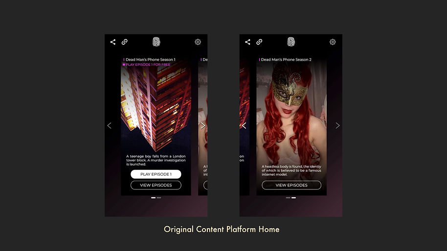
The project was driven by the need to prepare the platform for growth. A key challenge was the existing home screen layout, which presented a significant usability problem. The design featured a carousel of tall, horizontally scrolling posters, but users could only see a single, centered poster at a time.
Pain Points
The existing design had several pain points:
-
Unfamiliar Navigation: The only way to navigate the carousel was by manually touching arrow buttons, a pattern more consistent with websites than native mobile apps.
-
Hidden Content: The design disabled vertical scrolling on the home screen, which goes against a core user expectation for content discovery on mobile apps.
-
Inconsistent Experience: Once a user entered a piece of content to its 'episode select screen,' they would encounter a list of episodes with vertical scrolling, creating a jarring and inconsistent experience from the home screen.
Competitor Research And Insight
I began my research by conducting a competitor analysis, looking at both direct competitors (Episodes, Suspects, Choices) and major streaming services like Netflix and Disney+. The key insight was that all successful platforms in this space, from narrative games to major streaming services, utilised similar, vertically scrolling content library layouts.
This confirmed a core hypothesis: gamers and non-gamers alike would feel comfortable and confident navigating a content library of a similar layout.

Competitors Researched: Netflix, Disney+, Crunch Roll, 4oD, Amazon Prime, Episode, Suspects, Raddish Fiction, Crime Investigation Film
Strategy and Ideation
Designing to be Familiar and Flexible
My strategy for the redesign was built on two core principles: familiarity and flexibility. I wanted to create a front-end that felt instantly intuitive to users while also being a scalable, future-proof solution to serve the business for as long as it needed.
I devised a modular and flexible solution where the new design deployed a familiar, vertically scrolling layout, inspired by popular content platforms, whilst also working to include new important retention-oriented features, and improved navigation.

Even though the company was a 'phone first' business, looking at the company's user data told me that a significant number of players play the game on tablet devices, so I ensured I created layouts to show these use cases to the developers.

Modular and Skinnable Containers of Content
Each "category" was designed as a "skinnable" container, with a title component and the ability to house any type of content. This allowed the marketing and live operations teams to dynamically change genres, promote collections (e.g., "Currently Popular", or "Staff Picks" for instance), and control the order of content to meet the business's completion rate KPIs.

Here is an example of how the container components could be reused to show different genres. This modular system directly addressed the problems of discovery and scalability. The design enabled more and more content to be added over time without needing additional design or developer resources. This flexible solution proved to be a lasting success, serving the company to the day of writing this case study.
Execution and Outcomes
Final Designs
A key new feature was the "Continue Playing" section. This addition helped users seamlessly pick up where they left off, addressing a major usability gap in the previous design. It also proactively solved a future problem of users getting lost in the growing content library, aligning with the core design principles of familiarity and usability.

Final UI Designs with Branded Style
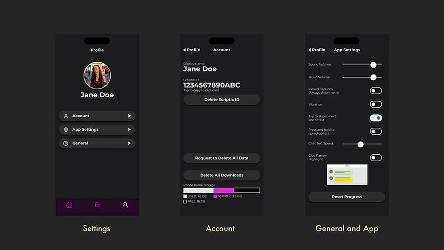
Final UI of Settings Section Cleanup
New Navigation Design
I also implemented a new navigation bar at the bottom, designed to be flexible enough to house new features in the future the business might want to build, as well as reinforce the feeling of familiarity and improve navigation within the app. The entire interface leveraged smooth vertical scrolling, with categories containing a lot of content having horizontal scrolling to improve content discovery.

As part of improving navigation and bringing the product in line with competitors on the market, the bottom navigation bar was designed in a way to house up to 5 tabs. This was so that the design scaled with the company when and if it needed to add an upcoming section for instance.
Handing Designs to Developers and Marketing
For handoff, I created thorough documentation in Confluence, including wireframes with layout guides, specific font sizes, and hex codes for colour tints. I also provided several different prototypes to showcase navigation and interaction design, as well as the final look and feel of the screens.
To ensure the new look was clean and ordered, I provided the marketing team with a style guide for poster layouts and the logo placement, ensuring all new content would seamlessly fit the updated interface.
Improved Engagement and Empowered Live Ops
The success of the new design was confirmed through A/B testing, which could be performed by the live ops team without design or developer support. The inclusion of a hero image always showing the newest release improved discoverability of new content, which in turn helped engagement and retention.

Lessons Learned
The Power in Modularity
Looking back, a key learning was the value of building flexible, modular design solutions. In a start-up environment, empowering other departments to work autonomously frees up design and development teams to focus on building the next big feature. The flexible component variations I created gave the internal team options beyond what I had even envisioned, which greatly helped increase discoverability and contributed to the project's long-term success.
No AI was used in the course of this project.
